The rapid rise of vibe coding in so many no-code platforms has transformed how teams design, test, and launch applications. What once required long design sprints, multiple stakeholders, and countless iterations can now be achieved in minutes with AI assisted no-code tools.
But speed doesn’t mean sacrificing UX/UI quality. The key is knowing how to translate prompts into beautiful interfaces and set up feedback loops that optimize user experience continuously.
Here’s where it gets exciting: LLM-powered design assistants are no longer limited to static mockups. Instead of searching endlessly for “UI design inspiration” or “mockup tools,” you’ll soon be able to describe your idea in plain language
“Design a clean, mobile-first dashboard with pastel colors and a collapsible side menu.”
With platforms like JDoodle.ai, the AI doesn’t just give you concepts - it instantly generates working UI components you can test, refine, and ship.
Why UX/UI Design with no-code app builders is Different
Traditional design workflows focus on tools like Figma, Sketch, or Adobe XD. No-code UX/UI, however, brings new rules:
- Prompts are the new wireframes: Describe your vision, let AI create layouts.
- Real-time testing: Get functional components, not just static mockups.
- Faster iteration cycles: Ship, test, and optimize directly in-platform.
Best Practices for Turning Prompts into Beautiful Interfaces
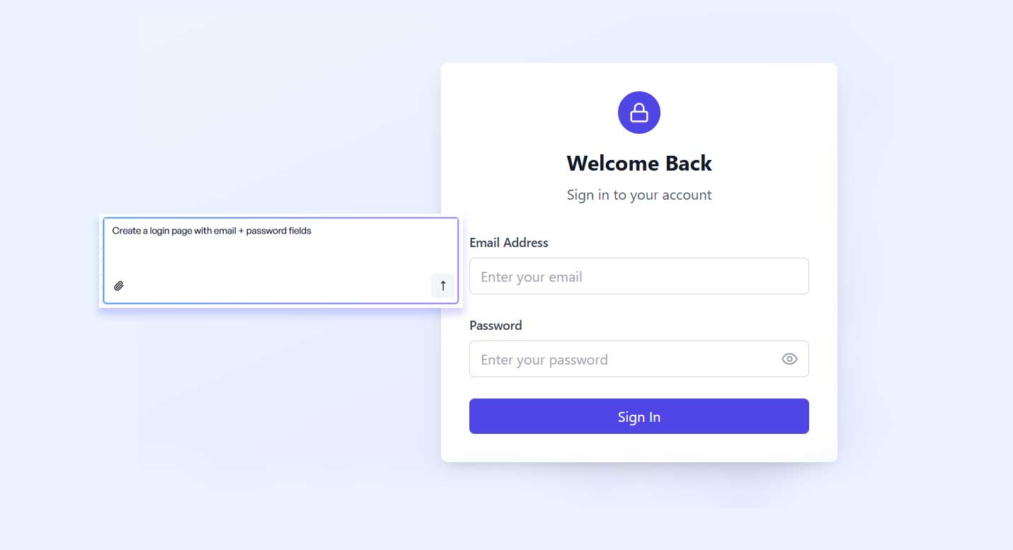
1. Write Clear, Context-Rich Prompts
Your prompt is your design brief. Instead of “make a login page”, try:
- “Create a minimalist login page with email + password fields, a rounded Sign In button. Keep spacing balanced and mobile-first.”
OR - You can upload a screenshot a of design you like and just ask JDoodle.ai to add it to your project or replicate the design in the screenshot
2. Apply UX Heuristics to AI-Generated Designs UX heuristics are a set of best-practice guidelines that help evaluate and improve a product’s usability. They are basically your rules of thumb.
LLMs are powerful but may miss usability details. Always apply UX heuristics:
Clarity over creativity → Labels should be simple, not clever.
Example: Instead of a button that says “Let’s Roll”, use “Start” or “Sign Up” so users instantly understand the action.Consistency across components → Typography, buttons, menus should look and behave the same.
Example: If one call-to-action button is rounded and green, all CTAs should follow that style—not a mix of shapes and colors.Error prevention & recovery → Design for mistakes users might make.
Example: Add an “Undo” option after deleting an item, or confirm before permanently removing data.
3. Prioritize Mobile-First Design
Over 70% of app usage is mobile. Start prompts with this in mind:
- “Generate a mobile-first dashboard with collapsible side menus.”
4. Incorporate Brand Identity from the Start
Prompts should bake in branding from day one so your design feels cohesive and recognizable. Don’t leave branding as an afterthought—make it part of the generation process.
Fonts → Specify your brand typography.
Colors → Drop in your exact brand color codes.
Logos → Include your brand logo placement (header, footer, favicon).
Tone & Imagery → Define whether your brand is playful, corporate, minimal, or bold.
Example prompt:
“Build a homepage with a playful tone, pastel palette, brand color codes #FF5733 & #2E86C1, our logo in the top-left corner, and headings styled with our brand font Montserrat*.”*
5. Optimize for Accessibility
Ensure WCAG 2.1 contrast ratios
WCAG = Web Content Accessibility Guidelines (the global standard).
“Contrast ratio” means the difference between text color and background color.
If text is too light against the background, it’s hard to read for many users.
Example: White text on a yellow background fails accessibility; white text on a dark blue background passes.
Add ARIA labels for screen readers
ARIA (Accessible Rich Internet Applications) labels help screen readers describe elements on a page.
Example: Instead of a button that just shows an icon (like a trash can), an ARIA label can tell a screen reader “Delete Item” so visually impaired users know what it does.
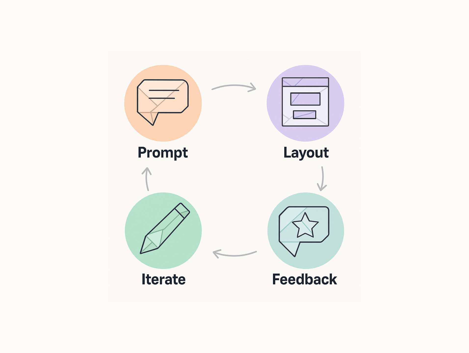
Feedback Loops:
Great UX isn’t “one and done.” Build continuous feedback loops:
AI → Prototype
You start by giving the AI a prompt (e.g., “Create a mobile-first login page with email + password fields”).
The AI instantly generates a working interface.
Users → Feedback
Real users interact with the design.
You gather feedback through tools like in-app surveys (“Was this page easy to use?”), heatmaps (where users click the most), or analytics (where users drop off).
AI → Refine
Instead of redesigning manually, you take that feedback and update your prompt (e.g., “Make the login button larger and move it above the fold”).
The AI quickly regenerates an improved version.
The loop repeats over and over, making your design smarter and more user-friendly with each cycle.
A feedback loop means design → test → improve → repeat.
It’s the secret weapon because no-code + AI makes this cycle so much faster than traditional design.
Final Thoughts
The best practices for UX/UI in no-code platforms are about:
- Writing context-rich prompts
- Applying UX heuristics
- Designing mobile-first
- Incorporating branding + accessibility
- And most importantly, optimizing feedback loops
Frequently Asked Questions (FAQs)
1. How does no-code change the role of UX/UI designers?
No-code doesn’t replace designers—it changes their focus. Instead of spending weeks wireframing and prototyping, designers become curators and optimizers.
2. Can AI-generated designs really be user-friendly?
Yes, but with a caveat. AI is great for speed and variety, but it can overlook usability details like clarity, consistency, and accessibility. That’s why applying UX heuristics and testing with real users is critical.
3. Will AI replace traditional UI/UX tools like Figma?
Not entirely. Tools like Figma are still powerful for detailed design work. But for rapid prototyping and testing, no-code platforms like JDoodle.ai can be faster. .
4. What prompts give the best UI results?
Start broad (e.g., “E-commerce homepage with hero section and product grid”).
Then refine details (colors, CTA placement, accessibility).
Layer in branding early to avoid generic results.
15. Will AI kill creativity in design?
Redditors generally say no—it actually removes grunt work (layouts, button placement) and lets designers focus on creativity, storytelling, and human-centered problem solving.
Related Posts
View All Posts »
How to Build a Website for a Makeup Artist in 11 Simple Steps
Learn how to build a clean makeup artist website that showcases your portfolio, lists services clearly, and helps clients book you easily, without needing technical skills.
How to Build a Website for a Gardener in 11 Simple Steps
Learn how to create a simple, professional gardening website that attracts local customers, showcases your work, and makes it easy to get enquiries, without needing technical skills.
How to Build Your SaaS MVP with an AI App Builder in 2026
A practical, step by step guide for founders, PMs, marketers, students, and indie hackers to ship a working SaaS MVP using an AI app builder with a built in database, without touching backend code or wrangling classic no code tools.